CAT SNAX — Packaging & Brand Identity
A playful packaging concept for a small-format cat treat box designed to stand out on shelf and feel instantly engaging.
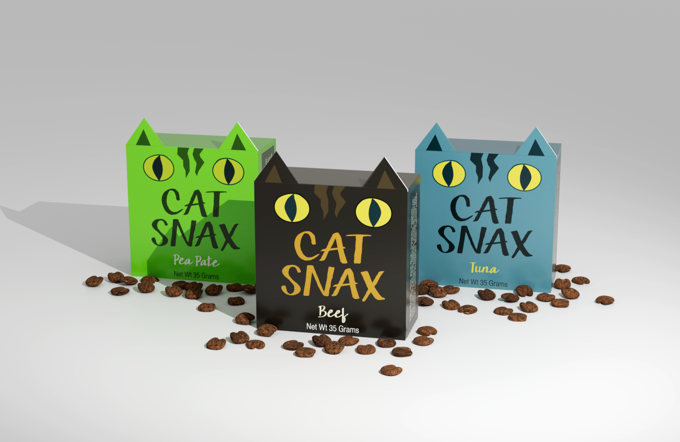
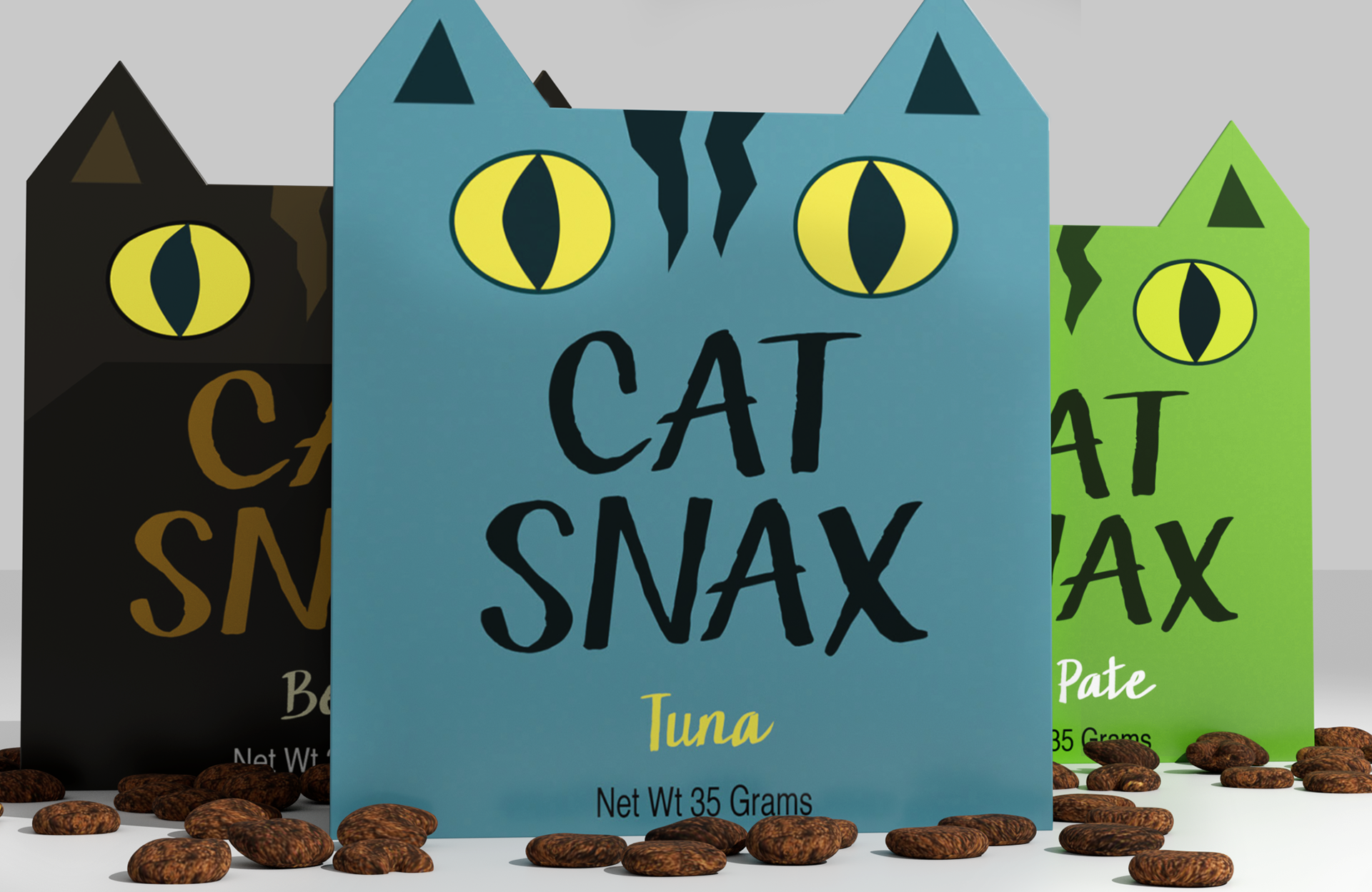
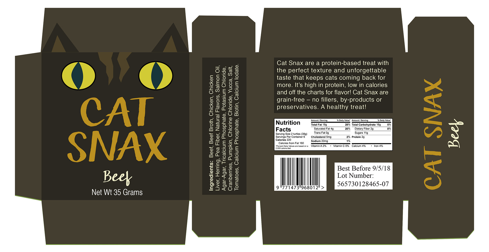
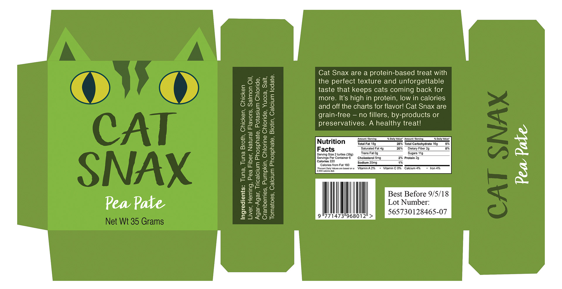
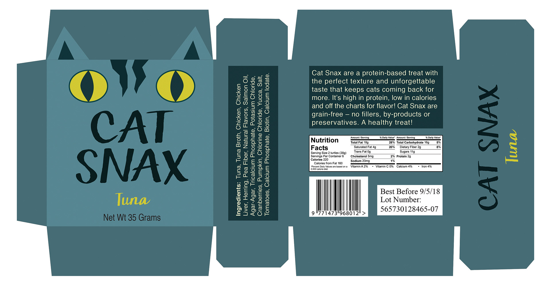
The structure transforms the box into a character, with folded ears extending beyond the form to create a distinctive silhouette and a moment of surprise. This simple construction detail adds personality while reinforcing the product’s purpose in a clear and memorable way.
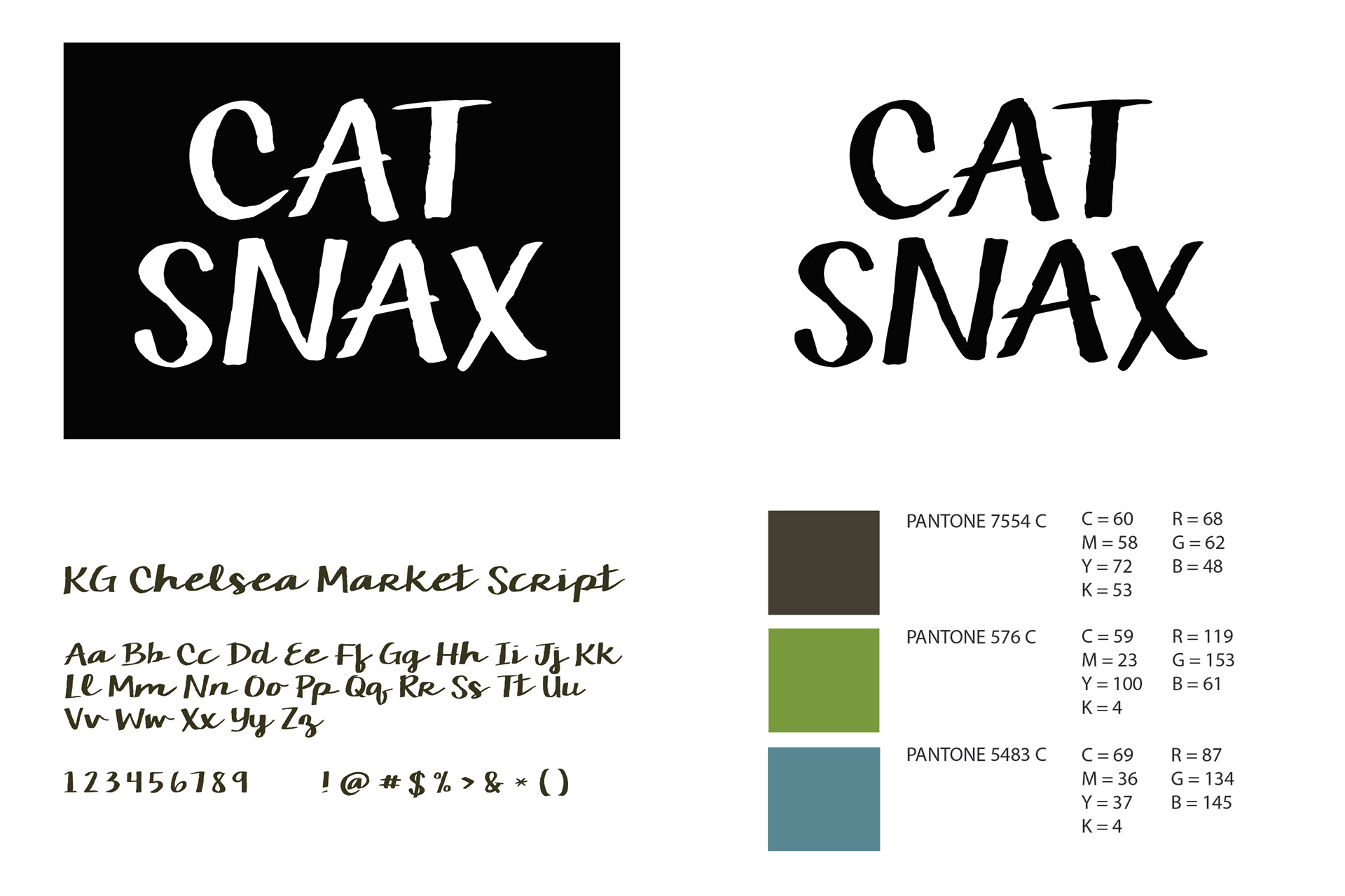
Each flavor is expressed as a different color “character”, using a bright, cohesive palette and a consistent visual system across the line. Hand-drawn illustration and expressive typography—referencing chalkboard signage and market-style lettering—give the brand an approachable, handmade feel.
The result is a compact, character-driven packaging system that combines clarity, humor, and strong visual impact.
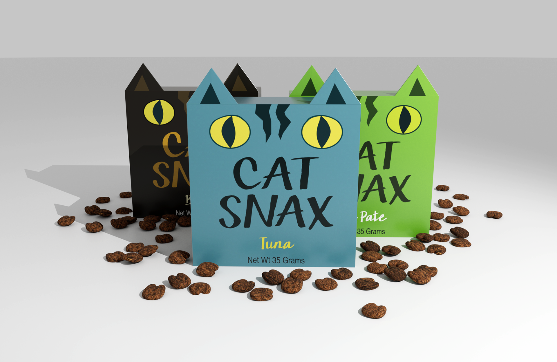
The packaging is built around a distinctive cat-ear silhouette, turning the box itself into part of the brand’s personality.
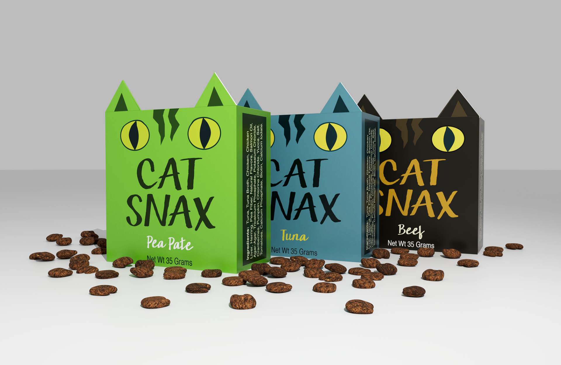
A consistent layout and color system allows each flavor to feel distinct while remaining part of a unified product line.
Flavor Patterns
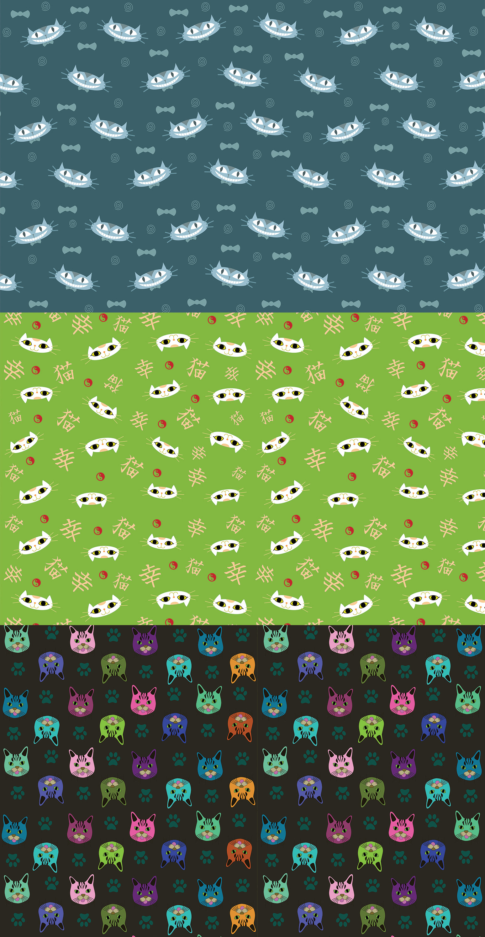
Each flavor features a custom patterned inner bag inspired by playful cat “characters.” The patterns echo the outer packaging through color and tone, extending the identity into a cohesive and expressive system.